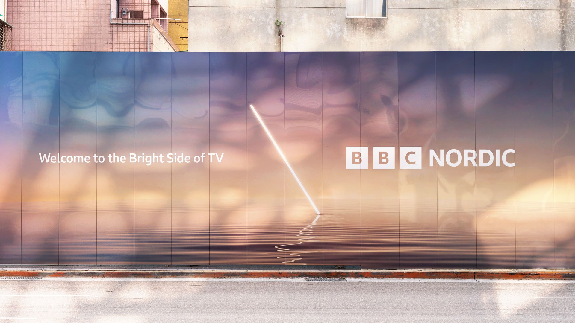
A new optimistic channel from the BBC for Scandinavia, a place of contrasts, of dark and light - this is 'The Bright Side'.
-
Our strategy for BBC Nordic / Nordic+ is built on insights from our Scandinavian audience and their culture and the channel programming. Conceived to capture the multi-faceted nature of the channel, the brand idea ‘The Bright Side’ conveys intelligence, wit and contrast.
Deeply rooted in strategy, the brand identity and on-air package reflects the brand idea and accompanying brand pillars.
The principles: ‘Bright Entertainment’, highlighting the channel's spark and optimism. ‘Warm Connections’ to celebrate the affinity that exists between the UK and Scandinavia. ‘Illuminating Moments’ to foreground the enlightening documentaries our audiences love. ‘Cultivating Contrasts’, as contrasts accentuate the emotional appeal of BBC Nordic's spectrum of programming - this is also neatly suggestive of the principle that where there is brightness, there is darkness too, speaking to the seasonal extremes of the region.
We also developed TOV principles for the channel - ‘Sparky’, ‘Welcoming’, ‘Curious’ and ‘Passionate’, which will influence all messaging throughout the brand - and taglines ‘Welcome to The Bright Side’ and ’The home of the brightest factual and feel-good TV.’ -
A 3D first approach
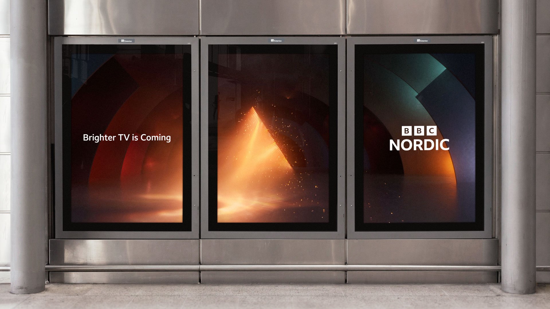
As a design-led motion studio when exploring ‘The Bright Side’ visually, we naturally turned to 3D and motion first to develop inspiration and inevitably the building blocks of our brand identity. As a jumping off point we took one of our design principles, surprising moments, and asked ourselves how we could inject surprise into light in a new way, whilst staying true to our brand strategy? Prisms became a key element to our exploration and how light could radiate from or be affected by them.
From this our motif ‘Prism Edge’ and the colour palette was forged.
-

-

-

-

-
The Prism Edge
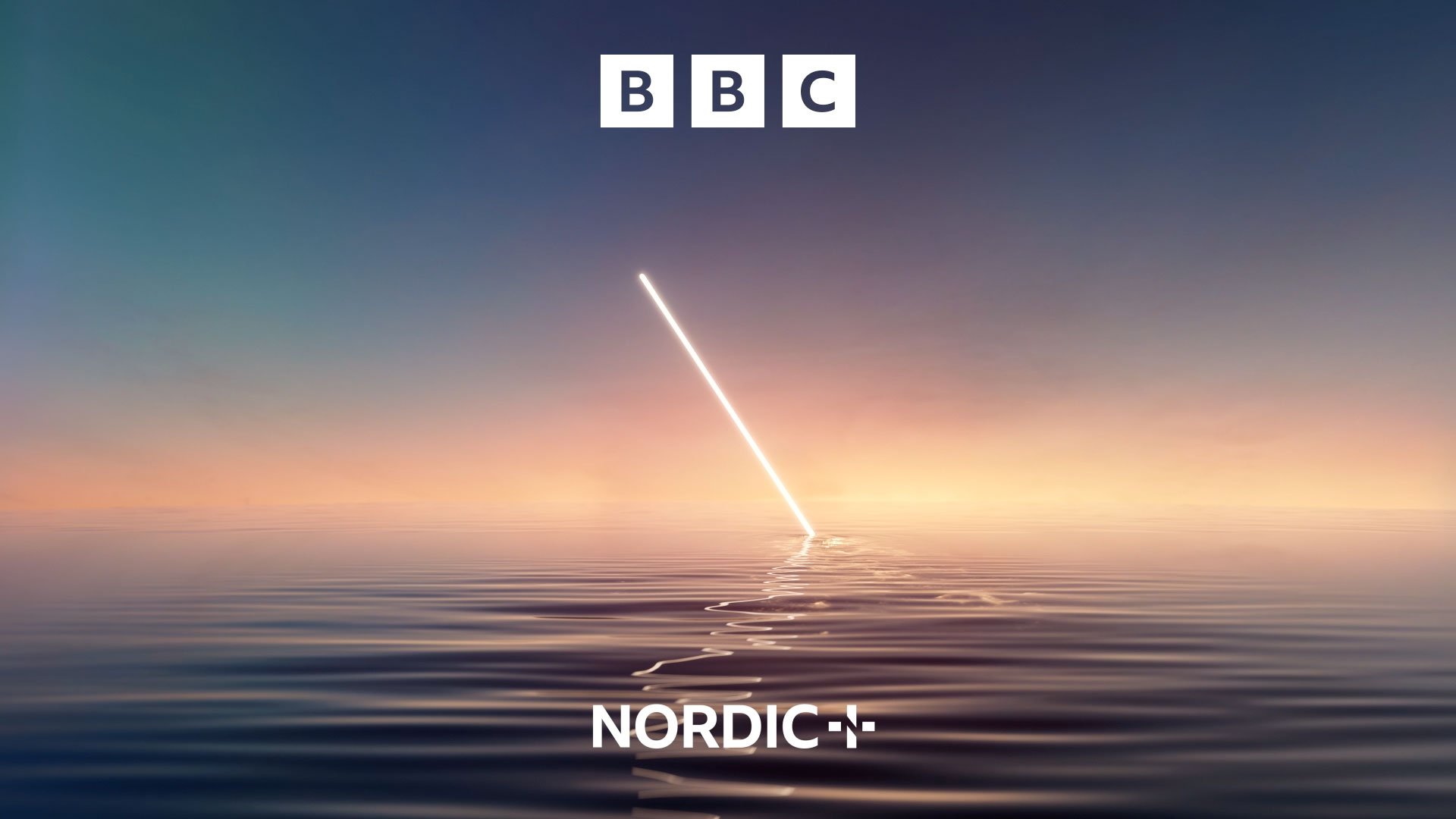
The core asset at the heart of the identity - a diagonal stroke referencing the central line of the Nordic ‘N’ - acts as an angular Prism Edge that both radiates and transforms light, embodying the essence of The Bright Side.
Building on this further with Nordic+ (the channel’s VOD offering), the angled edge is expressed in the negative space within the crafted + marque.
-

-

-

-

-
Prismatic palette
Our colour palette represents the colours generated when light is split from a prism edge. We focused on teal and orange as hero colours - full of light, contrasting ends of the spectrum and warm and cool collectively. The logo offers a bold green that nods to Nordic landscapes and classic muted tones found within Scandinavian design.
-

-

-

-

-
Illuminating OSP & Idents
The prism edge acts as a lens for our light, allowing the brand to create specific light treatments to reflect various behaviours or create a particular tone linked to time, sentiment or mood. The edge takes on unique behaviours, allowing it to embody different brand attributes, whether that’s through the speed or the way the edge presents itself to us, its movement or choreography (or lack of) in the space - or the more natural or man-made quality of the light.
It can become the curious documentarian hunting for the best shot in nature, or through its passionate and intense light emission it raises up and highlights contrasting opinions. Alternatively, it evokes the call and response between a performer and the crowd, bringing that moment of euphoria - always maintaining that the edge is the singular point of focus as it is our gateway to the Bright Side.
-

-

-
Sarah Johnson, Lead Creative at BBC Studios Creative EMEA
“BBC Studios have worked closely with the team at weareseventeen to bring BBC Nordic and BBC Nordic+ to life. Using our audience insight driven Creative approach, coupled with weareseventeen’s strong design expertise, together we’ve built a bright, warm and inviting brand identity across all platforms. We are delighted that it’s visually striking and reflects the full spectrum of content now available to our audience across the Nordics”.
-

-
Credits
- Exec Producer Jade Annaw
- Exec Creative Director Stephen Simmonds
- Strategy Director Craig Wood
- Creative Director - Brand Nick Bentley
- Creative Director OSP & idents Gary Roberts
- Producer Stuart Neilson
- Design Lead David Davies
- Senior Designer Chris Barker
- Motion Designers - Brand & 3D development Mario Ruggerio,
- David Davies,
- Jason Drew,
- Gabor Ekes,
- Serhat Goktas,
- Marcos Savignano,
- Joseph Winston,
- Arran Bish,
- Alban Contrepois
- Head of 3D - Idents Jason Drew
- Creative Leads Mario Ruggeri
- Gabor Ekes
- Motion Designers - Idents Gabor Ekes
- Mario Ruggerio
- Jason Drew
- Joe Maker
- Dan Fitzgerald
- Artworker Paul Martin
- TOV Copywriter Mary Ann Horgan
- Head of Creative Sarah Johnson (BBC Studios Creative)
- Production Manager Michaela Keefe (BBC Studios Creative)
- Client BBC Studios Creative
